

Transforming a main NPS detractor to a useful, organized notification destination
Role: Design Lead · Platforms: Web, iOS, Android · Duration: 4 weeks
Nextdoor notifications are a major paint point for neighbors, visually and functionally. In this project, we solved several issues which addressed complaints we often heard through research, resulting in a 2.3% increase in daily active users.
Problem
“I often miss important updates because the notifications tab is cluttered and hard to scan. It’s difficult to tell what’s new, what’s relevant to me, and what I’ve already seen, so I end up ignoring notifications altogether.”
Business goal
Increase user engagement and retention by improving the notifications tab so users can easily identify, prioritize, and act on relevant updates.
Challenge
How might we help users trust and easily engage with notifications?

Research insight
Neighbors like to get notifications that are time sensitive, which they wouldn’t have seen just by going to the feed and relevance based alerts on previously expressed interest.
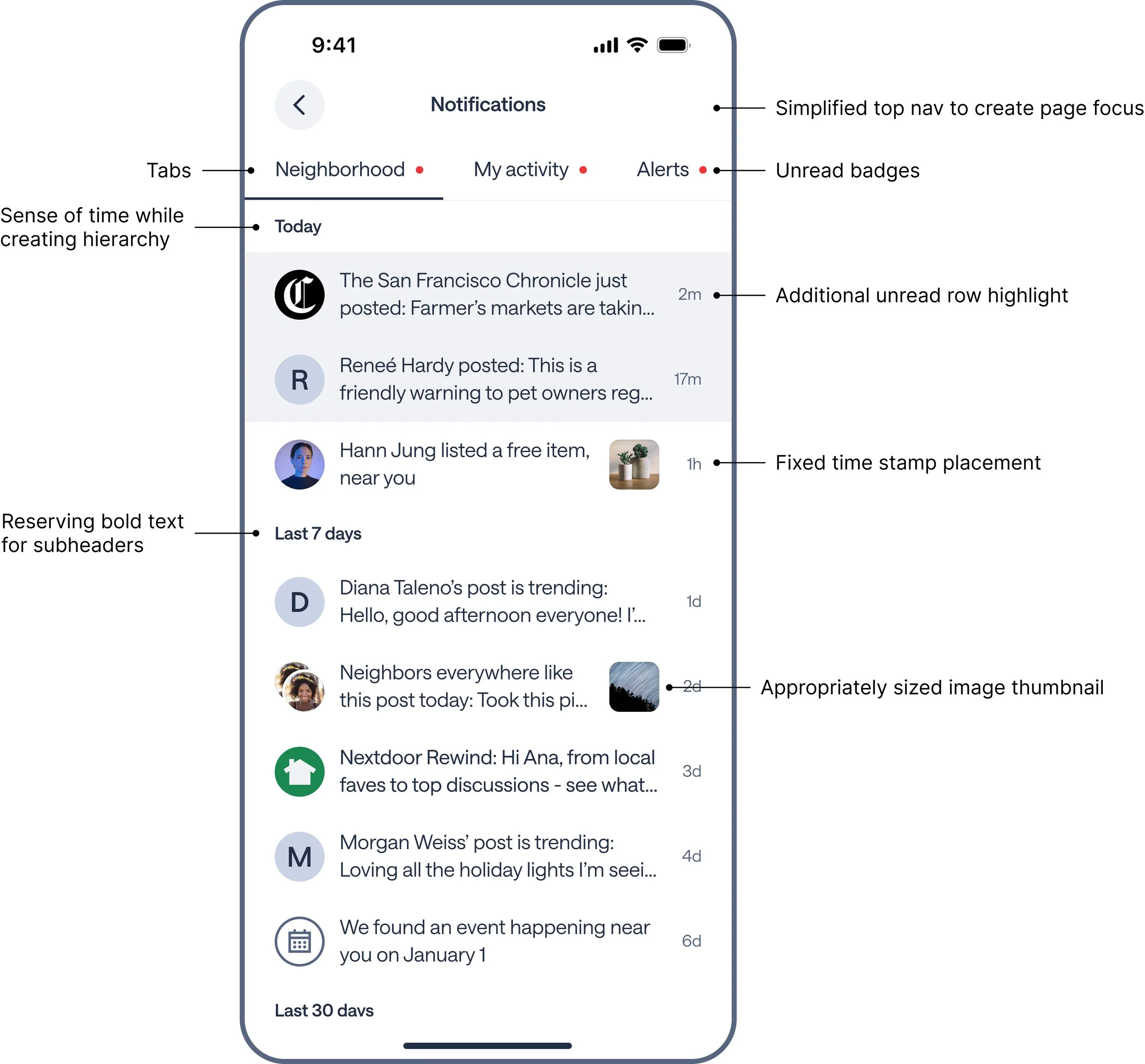
Update existing experience to use our new design system
Introduce tabs to organize notifications [nice to know, transactional, urgent]
Create visual hierarchy to bring more clarity to the UI
Add time-based sub-headers to add an additional layer of distinction and clarify that blue highlight = unread
Propose stripping away unused top navigation actions to bring more focus to the contents of the notification tab
One major challenge was balancing the differing opinions on how unread notifications and badging should work be visualized for the utmost clarity.
Approach

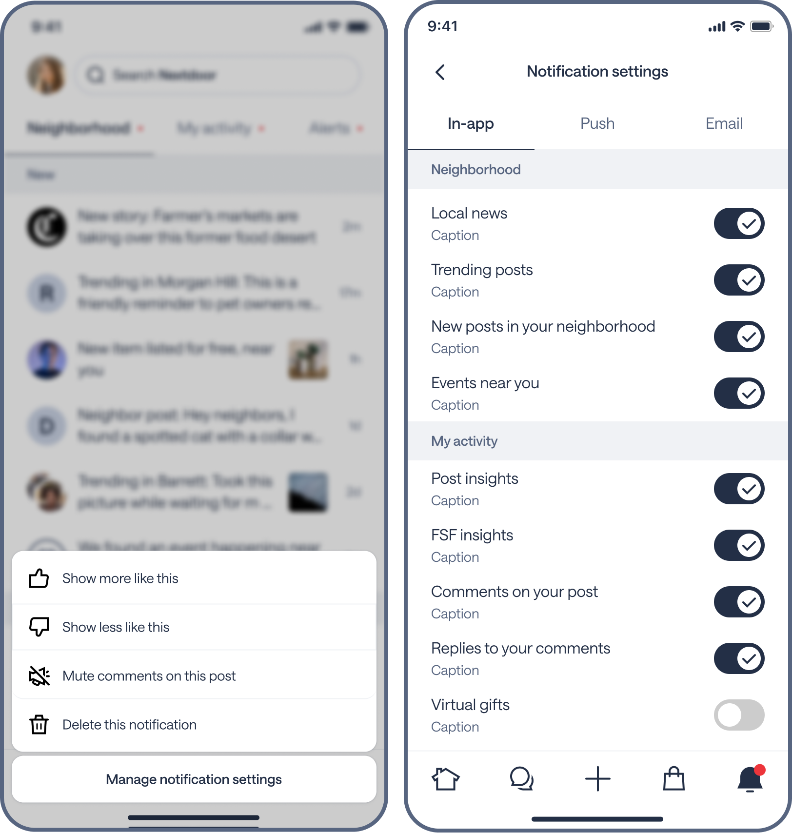
An additional area of focus I wanted to explore, was giving users more control over what they wanted to see. I worked with product and engineering to understand what was technically feasible on our end, and came up with these swipe to reveal actions. I also created an exploration for a new Notification Settings page.
Giving users more control
Design leadership strongly encouraged the team to test revealing a settings entry point in the top navigation, instead of hiding it in the bottom sheet. We A/B tested these 2 experiences, and what we quickly learned was that revealing the settings entry point led to a massive wave of unsubscribes across all notification types.
A/B test
My final design was informed by research and experiments. The layers of UI improvements led to a better UX, resulting in a 2.3% increase to daily active users after 1 month of releasing this new notification tab.
Final design
Step 1 was improving the UX of what currently exists. The next steps revolve around notification quality, quantity, badging logic, and push notification logic.