
Nextdoor Alerts
Unifying time-sensitive, alert-related information into a single collection
Role: Design Lead · Platforms: Web, iOS, Android · Duration: Ongoing
Problem
Today, information about a single local incident is fragmented across multiple posts and sources: third party ingested alerts, public agency announcements, news articles, and user-generated content. This leads to redundancy, confusion, and scattered conversations. Users struggle to piece together what’s happening and where to find credible updates.
Opportunity: Create a single, consolidated “pulse” for major local incidents (e.g., fires, severe weather, major crimes, power outages) that brings together multiple sources of information (alerts, news, agency posts, and neighbor posts) into one unified collection where neighbors can stay informed and discuss.
User needs
Timely information → Neighbors want quick, easily accessible answers about what’s happening around them (e.g., “what was that loud boom?” “why are there sirens?” “when will this construction end?”).
Fragmented information → Multiple posts & subsequent comment threads about the same incident across sources make it hard to follow. Neighbors have to dig to find the latest information.
Lack of credible updates on Alerts → Users want timely, trustworthy updates but only see vague or outdated info.
Business goals
Make Nextdoor top of mind for local current events, by driving utility both on platform & via SEO
Drive frequency of engagement by making major incidents easier to follow in one place
Drive conversations by providing relevant information sources to incentivize discussion
Improve trust and utility by blending official sources, news, and UGC
Approach
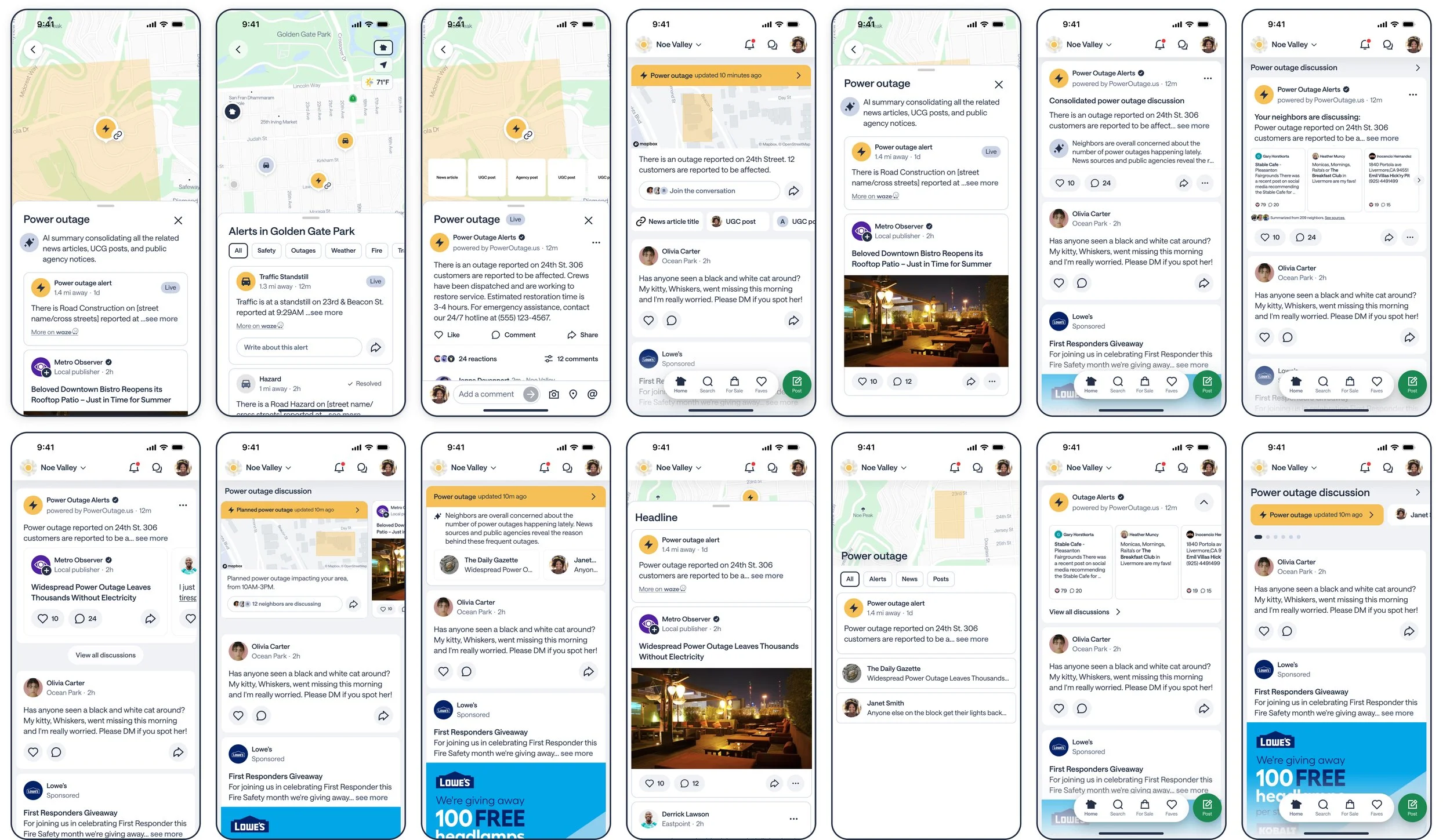
1.“Pulse” needed to exist in our top of feed component, Alert Map + bottom sheet UI. In order to quickly draft ideas, I explored layouts by mixing low and high fidelity wireframes, and brought in any design system components that could help get the ideas across.
2. My PM and I had a working session exploring each of these options, and removed what was unclear, not technically feasible for the project, or too tall for the feed (which impacts ad views).
3. I created a quick prototype of what the experience could look like, to make sure the interactions and flows made sense. I shared the prototype and static mocks with the engineering team, and gathered feedback.
Feedback & Iterations
I received great feedback around the card attachments within this top-of-feed component not showing enough information, and the avatars feeling too prominent.
On feed, we always have to be aware of how tall each card [we create] is, which is why I designed these attachments to be as short as possible. The feedback did make sense, so I updated the hierarchy and provided 2 line length options to test the impact on feed depth.
I made a few minor updates based on product strategy, such as adding comment bars to each content type, adding an AI generated summary, and differentiating the alert map pin from the other map pins.
One piece of UI I wish I had control over is the reaction bar due to the size of the buttons. Since these cards were built for Feed and show up on Feed, we had to use all of their UI. However in this view, they do appear a bit large and over-emphasized.

Final design
This feature is currently being built, so metrics will come in by the end of Q4 2025.